In other words, it shouldn’t matter whether you run your apps on an iPhone 11 Pro Max or an iPad 12.9” — either way, it should look good. The same holds true for dynamic content. Whether it’s a single line of text or twenty lines of text, your UI needs to adapt. With an adaptive layout, you can create a visually stunning app on all devices.
Auto Layout helps developers adapt user interface layouts for external and internal changes. Some examples include:
•
Different screen sizes.
•
iPadOS multitasking features like Slide Over, Split View and Picture in Picture.
•
Device rotation.
•
Larger text support.
•
Internationalization support.
•
Dynamic content support.
Superview
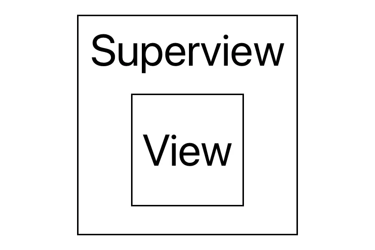
The superview is the view that contains a child view.
Every view has a superview, and every screen has a view. The standard view of a screen is the view controller’s view. It’s the base layer containing all of the user interfaces on a single screen. You can consider this view as a blank canvas because you can put any drawings on top of it.
Attributes
An attribute is a view feature Auto Layout uses to create a relationship between two views. There are two types of attributes: location and size. Location attributes include a view’s leading, trailing, top and bottom edges. Size attributes include the view’s width and height. Different user interfaces have different sets of attributes.
Multiplier
A multiplier is a ratio you can apply to a relationship between two item attributes. For example, you can have Label B be twice the height of Label A.
Constant
Constant is a fixed value that you add to a constraint. For example, Label A’s leading edge spaces 16 points away from the superview’s leading edge.
For a deep dive into the Auto Layout engine, read Chapter 14, “Under the Hood of Auto Layout.”
There are a few more key concepts that impact how Auto Layout works. These include intrinsic content size and priorities.
